Feb 2025
Illustrator, Pen & Paper
Gods & Earths Promotions
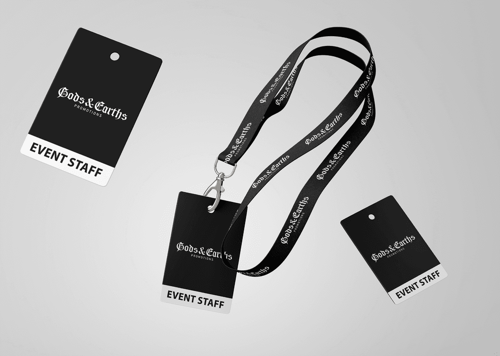
A wordmark logo created for a Vancouver Hardcore music promotions group.
Gods & Earths Promotions is a Vancouver-based music promotions group that focuses on booking local shows featuring Hardcore bands.
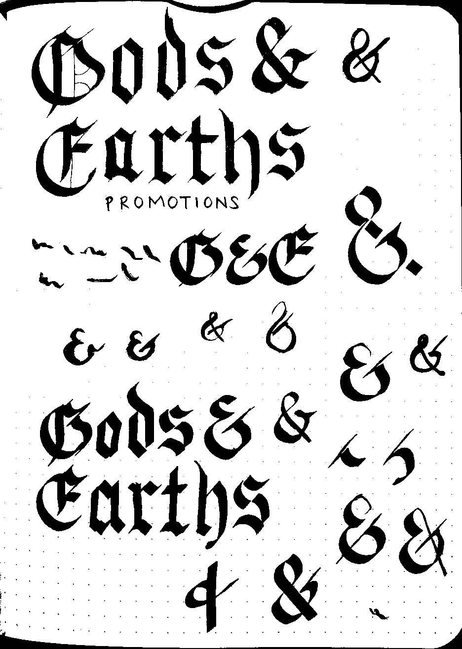
They needed a simple logo to kickstart their launch and promote their first upcoming show. I based the initial design off of the commonly used 'Old English' type font but paid attention to increasing the legibility of certain glyphs as some could be easily mistaken as other letters. It was a bit of a challenge as this type of font is very iconic and already has a set look for each glyph but I wanted to try to add my own touch to it to increase legibility of some letters.
Before I made the logo digitally, I used a fountain pen and paper to plan out how I wanted the logo to look overall and it also allowed me to enjoy using the skills I learned in my hobby.


